Saturday, July 6, 2013

Look to the east, young cutters of paper!

Last week I posted about what I do every summer at URJ Camp Newman – teaching kids to cut paper. This post concerns these fine young campers' first projects: mizrach plaques.


Mizrach (מזרח) means "east" — the direction that Jews outside of Israel traditionally face during prayer, and a mizrach is an ornamental wall plaque used to indicate the direction of prayer.


Each day at camp has a special theme, and the theme on the day we began our mizrachs was "chaverut" (friendship) — so in the spirit of friendship we started off with some group brainstorming, making a list of themes and ideas for a mizrach, such as the rising sun, Israel, a compass, Jerusalem, and so on.
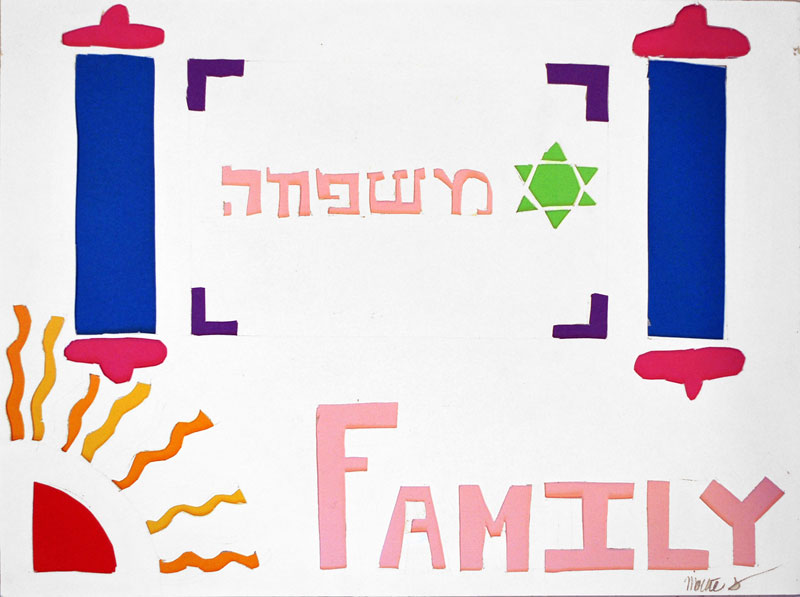

Each camper was allowed to interpret the idea of a mizrach however they wanted, but they all started with the same pool of ideas. That's what made the project so fascinating: seeing how they all started with the same source material, and how their interpretations created so many variations.


The campers used cut-up colored papers and comic books to back their pieces, just as I do in my studio. Where did I get so many comics? So many that I could let the campers cut them all up and experiment?


From my friendly neighborhood comics shop, Brave New World Comics — so a big thank-you goes out to Portlyn and the rest of the crew there!


The campers made some incredible art – and art with a purpose. As with so much Jewish artistic expression, there is a second purpose (if we can call art for art's sake a purpose, which I guess is sort of oxymoronic): it serves a function.


In this case, the mizrach identifies a direction for prayer... but think about the beautiful menorahs we light at Hanukkah, and the care we take to select aromatic and attractive etrogs for Sukkot, or the fancy seder plates for Pesach...


Why do we go through all this work just to fancy up things we use so infrequently? Wouldn't a plain set of candles do the same job as fancy silver candlesticks? Yes... and no.


We do this because we are commanded to beautify our celebrations and rituals (and the objects we use in them). It's called "hiddur mitzvah" – the commandment to make our observance of mitzvot beautiful.


It was a pleasure to share with these campers not just the joy of making art, but to do so with a Jewish focus.


To share with them the pleasure of cutting paper and engaging with our culture and history — of being part of a tradition of Jewish artisans that extends back to Bezalel, in the desert, building the tabernacle.


My next post will feature photos of the campers' second project: paper midrash. In the meantime, enjoy their mizrachs.


And if you want any more information on these workshops, just ask!

Tuesday, July 2, 2013

Student papercutting workshops


Every summer I spend two weeks at URJ Camp Newman as an artist-in-residence, teaching papercutting to high school-age campers. Their program is called Hagigah, and it's focused on expressing Judaism through the arts – so they paint, they sculpt, they dance and sing and write... in addition to everything else you'd expect at Jewish sleepaway camp.

This has been my seventh summer at Camp Newman, and I had two great groups of campers to work with: two hours each day with the yetzirah group, and one hour each day with the hizdamnut group. It was a pleasure to share with them the joy of working in paper and creating art.

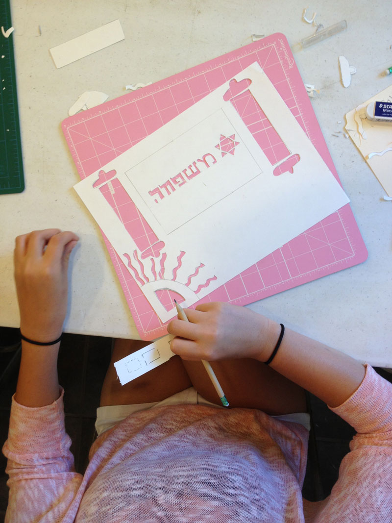
Each of the campers in both groups made a mizrach (מזרח means "east"). East is the direction that Jews outside of Israel traditionally face during prayer, and a mizrach is an ornamental wall plaque used to indicate the direction of prayer – and that's what the students made, after some group brainstorming about what imagery might work in such an artwork. They were allowed to interpret the idea of a mizrach however they wanted.

All of the campers in the yetzirah group (and many in the hizdamnut group, time permitting) also made "paper midrash" – they used their newly-developed papercutting skills to tell a story from the Tanakh (Torah, prophets, and writings) or midrash, picking a story or theme that was personally meaningful and interpreting it in this medium.

The final project we all worked on was a group effort... details to come.

Later this week I'll share photos of the art they produced, but for now please enjoy these photos of the campers at work.


Monday, June 24, 2013

Yarn bombing!

I loved the idea of yarn bombing when I first heard of it, and I've seen pix online... but this is the first time I've seen it live – a park full of trees, all covered in yarn. Some even had mittens!


Wednesday, June 5, 2013

Tutankhamun Identity Usage Standards

Once upon a time, a long time ago, in a...

So yeah, once I was a graphic designer, and I decided I'd seen plenty of style guides, and wouldn't it be fun (I chuckled to myself) to make one for King Tut? So I did.

I never finished it, nor published it, but I've made some JPEGs of some of the intended work for your enjoyment. Feel free to share it or whatever; just please credit me if you do.


Thursday, May 30, 2013

Doctrine of Law

This is "Doctrine of Law," a papercut I made for the silent auction at Temple Ahavat Shalom's gala this year. The gala and auction are being held this Sunday, June 2, and support temple activities throughout the year. If you haven't gotten your tickets yet, or if you want more information about the auction, click here. A full list of auction items is available as a PDF.

"Doctrine of Law" is an exploration of the role of Torah – the "tree of life" – in our lives, in the past and present. I see Torah as a living document, one that must be read and reread and continuously interpreted and understood for each generation; the tree will always be an appropriate metaphor for Torah. It's backed with cut-up comics and a snippet from Ye That Thirst by David Hausdorff, published by Shulsinger Brothers in Brooklyn in 1940; that snippet is how this cut got its name.

Wednesday, May 29, 2013

Little Green

"Little Green" is a papercut I created for the annual gala (this Saturday, June 1) at Temple Emanuel of Beverly Hills, which supports their day school, early childhood center, and religious school. I've been friends with their cantor, Yonah Kliger, since junior high – and when he asked for a piece to support their gala, I was glad to make something special for him.

"Little Green" is an exploration of the story of the Burning Bush, which the Torah tells us burns but was not consumed – represented here by the swatch of living green at the center of the bush. The sharp, jagged flames are a reflection of the clear, sharp voice of God speaking to Moses from the bush, and the light it casts is so bright as to make the sky appear dark as night.

It measures 6" x 8" but is in a fancy frame I selected for it that takes it to 17" x 22".

Tuesday, May 28, 2013

Burning Bush, Open Door


I just received a copy of Open Deur, a Netherlands magazine which is featuring my "Burning Bush: Flame On" papercut in their May issue. I can't read it, but I see the name "Mozes." There is a lot of fire and flame and heat in this issue.

Plus, now I know how to write the name of this papercut in Dutch: "Brandende struik: ga door met vlammen."

Friday, May 24, 2013

Oppenheimer


It's hard to believe the end of another show is already almost here. Figured I'd share a photo of one more piece – it's called "Oppenheimer."

Upon seeing the first test of the atom bomb, which he helped create, Dr. J. Robert Oppenheimer said these words from the Hindu scriptural epic, Bhagavad Gita. The power of the atom has given us good and bad, and we see a dichotomy of intention and result in the character of the Hulk, whose comics are cut up to make this background of this papercut. There’s one snippet that’s not the Hulk: the Watchmen’s Dr. Manhattan makes an appearance as well. It includes:

•    Incredible Hulk #21 (Jun 2001) – John Romita, Jr.; #38 (May 2002)
•    Incredible Hulk #9 (Aug 2012) – Michael Komarck
•    The Incredible Hulk #240 (Oct 1979), #310 (Aug 1985), #448 (Dec 1996)
•    World War Hulk: Front Line #1 (Aug 2007), #5 (Dec 2007)
•    Marvel Fanfare #29 (Nov 1986) – John Byrne
•    Hulk #11 (Jun 2009) – Ed McGuinness
•    Giant-Size Incredible Hulk #1 (Jul 2008)
•    The Essential Hulk Volume One (1999) – Bruce Timm
•    Indestructible Hulk #6 (Jun 2013) – Walt Simonson
•    Hulk & Thing: Hard Knocks #2 (Dec 2004)
•    Before Watchmen: Ozymandias #5 (Mar 2013) – Jae Lee


A color catalog of all works on display is available for download as a PDF here.

Monday, May 20, 2013

Miriam's Well – Embrace the Possibilities

I'm very pleased to share with you a photo of my latest completed papercut — "Miriam's Well"— a commission celebrating and honoring the outgoing president at my synagogue, Temple Ahavat Shalom. It measures 26" x 40" and, as usual, features cut-up comics.

While the Jewish people wandered through the wilderness they were accompanied by a wondrous well which would provide water for them at every resting-place. God created this well for the sustenance of the Israelites in recognition of the merits of Miriam, which is how it gets its name. The well followed them on all their wanderings — and wherever they halted, it halted, too, settling in position opposite the Tabernacle. The leaders of the twelve tribes would appear and chant to it, “Spring up, o well,” and water would gush forth from its depths, and shoot up high as pillars, then discharge itself into great streams. These streams demarcated areas for each of the twelve tribes to camp in, and were so powerful that people were obliged to make use of ships to visit one another. The water led beyond the encampments, where it caused to grow every conceivable kind of plant and tree; and these trees, owing to the miraculous water, daily bore fresh fruits.

This president has dedicated her time a similar nurturing of the synagogue community (as well as the larger community), welling forth with tikkun olam and justice. Her leadership has sustained this community, and helped to create an environment in which everyone can “embrace the possibilities.”

The water of the well is backed with cut-up comic books featuring famed female comic book leaders and heroes, notably Supergirl, Wonder Woman, and Batgirl. Within the swirls of color can be found speech bubbles that reflect on her presidency and her dedication to helping others.

The well is represented by the hint of a Torah scroll from a synagogue brochure, while the twelve spaces surrounding the well represent the twelve tribes, and are backed with cut-up temple materials. Above and below the well and the tribes are desert landscapes created from cut-up comics and photographic imagery of the desert in which the Israelites wandered.

Saturday, May 18, 2013

Online bidding now open for
"Spring Comes to Santa Clarita"


As I mentioned a few weeks ago, I created a papercut titled "Spring Comes to Santa Clarita" for the Albert Einstein Academy 2013 silent auction, which raises money for the school. It's now available for online bidding – click here for more information or to place a bid.

This landscape is typical of the Mediterranean-style climate in Santa Clarita, featuring rolling hills covered with flora and scrub in a variety of colors and patterns. And of course, it's backed with cut-up comic books.

Spring Comes to Santa Clarita
20" x 10"
Mixed media
2013

Thursday, May 16, 2013

Herzl


"Herzl" is a papercut I made based on a photograph of Theodore Herzl at the First Zionist Congress in 1897, in Basel, Switzerland. This piece takes on more significance for me now as my family is planning a trip to Israel.

However, it seems that not many people are as familiar with the original photograph as I am – which is fine; it's a touchstone for me, but not for everybody. So I thought it would be useful to present the original photo alongside my portrait, for those who are interested.

My portrait is made with cut-up Green Lantern comics – because Herzl is known for the words, "Im tirtzu, ein zo agada" – "If you will it, it is no dream." And of course, Green Lantern's ring is powered by willpower.

You can still see it live at "You did WHAT to my comics?!?",  now showing at Brave New World Comics in Newhall, California (details here). A color catalog of all works on display is available for download as a PDF here – and though many of them have sold, there are a few works still available for purchase.

Friday, May 3, 2013

"Number Theory"


I'm pleased to be donating a papercut to ANOTHER fundraising auction happening tomorrow – this one being held at Brave New World Comics on Free Comic Book Day (tomorrow, May the Fourth) to support the Newhall Public Library!

"Number Theory" is built on a structure of the ten basic Hindu-Arabic numerals (0123456789), and it's about the power of individuals working together. Each person has their particular strengths and skills and backgrounds, and they become magnified by the presence of others. We can all be heroes, and so the background texture for the cut is a collection of superheroes, representing the strength of diversity.

Interested in bidding? You do NOT have to be present to bid; just call the shop at 661 259 4745!

Number Theory
10" x 18"
Mixed media

Thursday, May 2, 2013

Spring Comes to Santa Clarita


This papercut is titled, "Spring Comes to Santa Clarita" – I made it for the Albert Einstein Academy  auction being held this Saturday night, May 4; proceeds go to support this local charter school. I modeled it on the rolling hills along Newhall Ranch Road out here in Santa Clarita, with rolling hills covered with flora and scrub in a variety of colors and patterns.

Spring Comes to Santa Clarita
20" x 10"
Mixed media
2013

Monday, April 29, 2013

Art and tacos!


Join me this Wednesday for art and tacos at Brave New World Comics!

Friday, April 26, 2013

The Door is Always Open

Last night my wife and I attended the opening of Gary Baseman's exhibition, "The Door is Always Open," at the Skirball Cultural Center in Los Angeles.

Wow.

I've been following what he's been doing for years, having been first introduced to his work when his was primarily doing commercial illustration for hire, and I've been consistently amazed by what he's done over the years.

This show "explores the influences of Baseman’s Jewish family heritage and American popular culture on his exuberant, boundary-defying art" and centers around his childhood home, which he recreated in the exhibit space by bringing in furniture and furnishings from his parents' home – as well as countless family photos and other items. The result? It's Gary Baseman's upbringing, in three dimensions: we see the dinner table set for Shabbat, featuring his little Magi figurines; we look at photos of his family's Passover seders and his bar mitzvah next to paintings of his "magical gefilte fish" and other contemporary subjects; we sit on his old velvety couch underneath a chandelier he fashioned in the shape of his "happy idiot" snowman.


 So yeah, there's a lot to see – and I highly recommend it to anyone who's able to come.

But what I really wanted to write about was how inspiring it is to see an artist like Gary Baseman embracing his tradition and upbringing, and seeing it come through so strongly in his work. The characters, the imagery, the themes and the stories all have roots in the his family history – and the history of the Jewish people. Girl wearing tefillin? Check.


My work is, of course, heavily influenced by my Judaism, so I am particularly affected when I see someone else drawing from the same well to create work that is so unique, so beautiful, so affecting... so powerful.

The night ended with a dedication of the "house" – complete with a custom mezuzah which he designed. How's that for a pervasive pop culture art happening in La La Land? The most well-attended mezuzah hanging I've ever been to.


 Mazal tov, Gary – and yasher koach.

The secret of "The Golem"

Here's how to spot the "secret" Hebrew letters in my papercut, "The Golem" (if you've come here by QR code, welcome aboard!):


See it live at "You did WHAT to my comics?!?" (details here).
A color catalog of all works on display is available for download as a PDF here.

Thursday, April 25, 2013

Inundación

This is "Inundación," a new papercut I'm premiering this Saturday night at Brave New World Comics, as part of my new show: "You did WHAT to my comics?!?"

The story of the flood pervades many cultures across the globe. "Inundación" draws from Biblical narrative and Mesoamerican iconography, backed almost entirely by cut-up pieces from the 2008 trade edition of Jack Kirby’s mid-70s comic book series "The Eternals." The one exception is a snippet of text from LIFE Nature Library: The Sea published by Time-Life Books in 1972.

For more details about the show, click here.

Thursday, April 18, 2013

Join me for opening night on April 27
at Brave New World in Southern California

I'm very excited about this show! The pictures are framed, the catalog is in development, the food and beverages are planned... and it's fewer than ten days away.

Brave New World Comics is such a great venue for me – it's my local comic shop where I buy all my comics, owned and operated by a great friend, and right here in my hometown. It's a small, intimate space, and I'm looking forward to having it filled up with friends for a night of art and pop culture kibitzing. See you there!

Wednesday, April 10, 2013

Smallville


This is a photo of "Smallville" — a papercut premiering at my next show, at Brave New World Comics in Newhall (Santa Clarita), California.

Please join me at the opening on Saturday night, April 27, from 7 to 10 p.m. Details here.

"Smallville" is 18" x 24" and backed with cut-up Superman comics primarily featuring Smallville, the town where Kal-El was raised; as well, the piece includes bits and pieces of Superman's Fortress of Solitude, and a little Metropolis as well.

The papercut explores the immigrant experience in America – the Statue of Liberty being the entrypoint for many a new American, while Smallville is Kal-El's Statue of Liberty; it's where he becomes an American (an Earthman, really) and where he learns what it is to be human. It's where he learns to be a part of our civilization... but of course he also has his special place to be alone, his Fortress of Solitude – where he can truly be himself, amongst Kryptonian architecture and artifacts. This papercut is an exploration of the dichotomy between staying true to one's origins and assimilating into the larger culture.

The papercut includes pieces from:
  • Action Comics 839 (Jul 2006), 903 (Sep 2011), and 15 (Feb 2013) — Geoff Johns, Kurt Busiek, Renato Guedes 
  • Superboy 8 (Aug 2011), 10 (Oct 2011), 15 (Feb 2013), 16 (Mar 2013) and Annual #1 (Mar 2013) — Tom DeFalco, RB Silva, Rob Lean
  • Superman 3 (Jan 2012), 15 (Feb 2013) — Scott Lobdell and Kenneth Rocafort 
  • All-Star Superman 5 (Sep 2006), 11 (Jul 2007) — Grant Morisson and Frank Quitely 
  • Adventure Comics  455 (Jan-Feb 1978) — Juan Ortiz and Vince Colletta 
  • Teen Titans 7 (Mar 2004) — Geoff Johns and Tom Grummett 
  • Supergirl 15 (Feb 2013) — Mike Johnson and Mahmud Asrar 
  • Superman: Peace on Earth (Jan 19990 — Alex Ross and Paul Dini 
  • Shatter (1988) — Peter Gillis and Mike Saenz
  • Etc. Book One (1989) — Tim Conrad and Michael Davis

Sunday, April 7, 2013

Workshops at Temple Beth Am

Today was day one (of two) of the papercutting workshops I'm leading at the The Rabbi Jacob Pressman Academy at Temple Beth Am in Los Angeles.

Great school, from what I can tell – they bring in about a dozen artists during the year leading various workshops, including lettering/calligraphy and stencil art (and papercutting, of course).

Good kids and no injuries – what else could I ask for? Here are a few shots of us at work.